
The pictures and graphs in this post were found on the resource which is neither management oriented nor IT-related. The main topics covered there are design, creativity and architecture. But, as we have already seen in a motivation movie, proper design and creative representation of information can often be at least as much important as the content of the message. That particular post I’ll refer to here was written by Steph and devoted to Infographics – the art of making news, scientific data and other information far easier to perceive and digest.
Most businesses and business relations today can be hardly described by linear models alone, like the classic production chain model. The world is full of interrelations and interactions. For some companies this means the network of local suppliers, clients and partners. For others the geography encompasses the whole world with different languages, different time-zones and different legal regulations. The most advanced and strategic-thinking businesses actively add the time aspect, the dynamics of interactions to additionally address risks and opportunities. (In a publication by McKinsey “Building the supply chain of the future” you can find examples of how the dynamics aspect is addressed by some companies).
All this makes networks of relations even more complex and difficult to describe.
Information is only powerful and useful when it can be easily perceived and understood. Of course, there exist proven scientific ways to describe networks and processes in them. This diagram I’ve seen lately in the ITIL Service Strategy book was an example of Value Net Diagram approach:

Far to often such methods make the message too complicated and overcrowded with details. Bringing to the addressee an elaborate detailed description they forget the main goal of any model – to ease the perception and make it a pleasant experience.
But let’s have a look at what I’ve found at the WebUrbanist site.
Lawsuits in Mobile Business
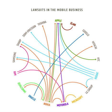
(image via: design language)
The number of participants and arrows is comparable to those on the image above. But add colors, arrange the elements properly and focus on one thing, and you will get absolutely different picture in terms of perception.
The Colors of the Web
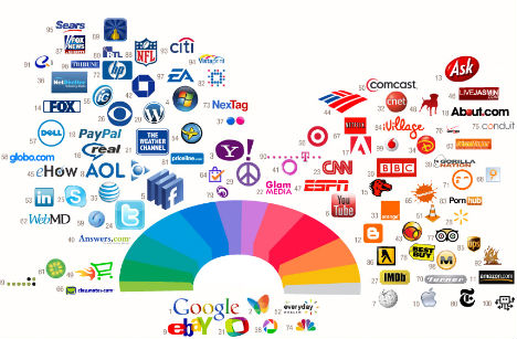
(image via: colourlovers)
Another even more colorful picture shows exactly that – the colors represented in web logo’s.
iPad’s Competition
Only lazy has not heard or read about the iPad’s successes last year. According to Mashable (based on IDC reports) in just one quarter, the iPad helped drive up sales of media tablets by 45% and took nearly 90% of the market. The Apple COO has boldly stated that iPad has a “huge, first-mover advantage” and that Android-based devices are “bizarre product[s]” with no “real tablet experience”. But is that all of competition iPad faced in 2010 and will face in 2011?

(image via: section design)
Information Sharing in 2010
But let’s get back to information and its sharing. This graph compares Facebook to other information sharing services on different dimensions.
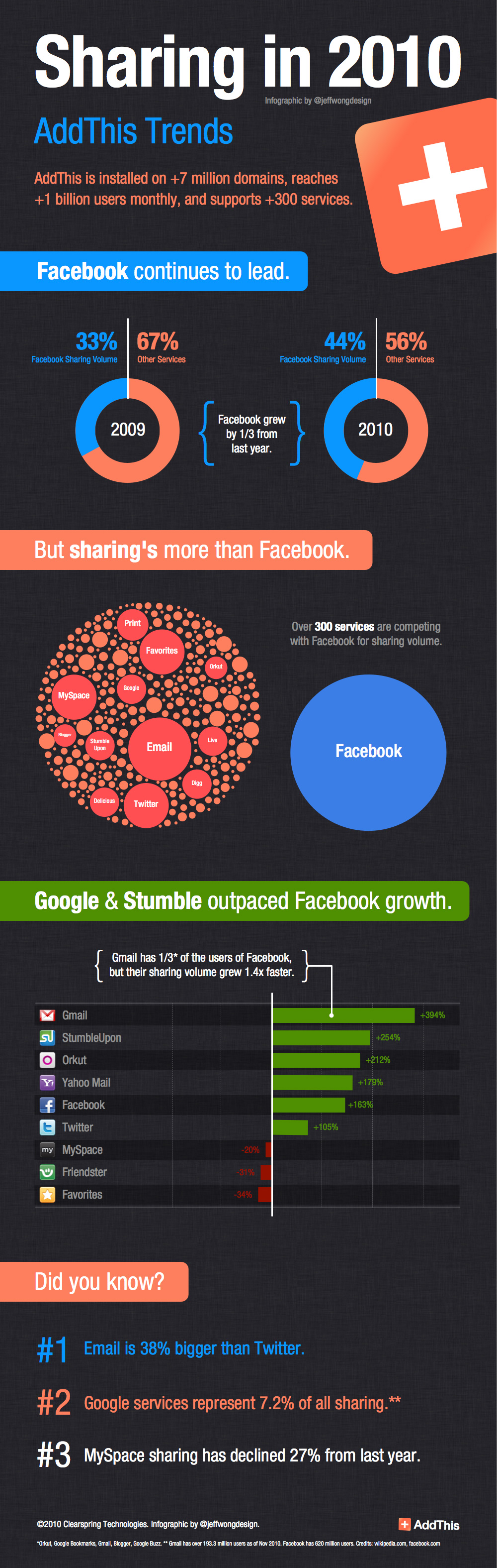
(image via: add this)
Use Social Media to Build the Company
This image is a great example of infographics. It is clear and concise, and makes the information easy to digest with bright colors and eye-catching visuals.
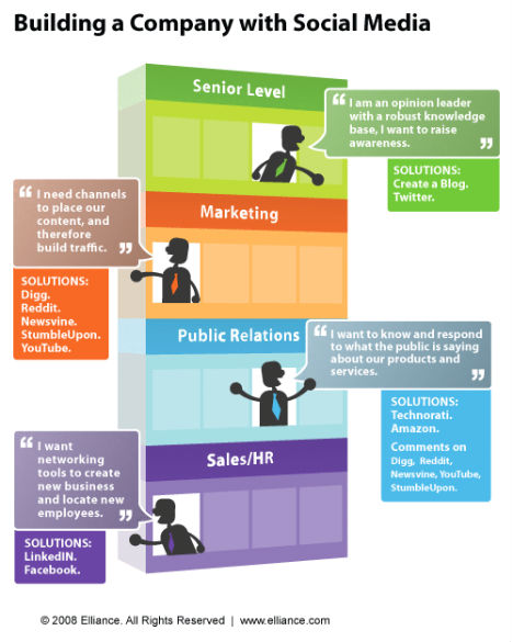
(image via: elliance)
Media Timeline
Just look at the diversity of information sources we use now. No doubt, in any of them information should be useful and easily perceived to stay-out from the competition.
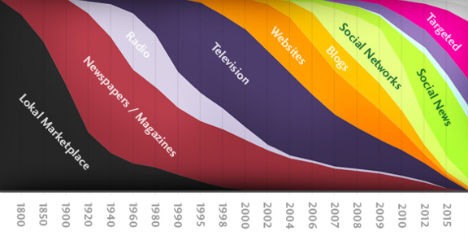
(image via: design you trust)
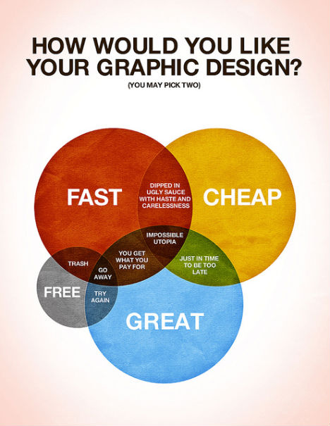
How Would You Like Your Graphic Design?
And the last example. Funny and with some retro-touch, I believe it's applicable to any business, not only design.
(image via: colin harman)
You can find more examples of Infographics on the WebUrbanist page.
Stay inspired and keep it simple.